Why Your Mortgage Website Sucks (and What to Do About It)

I’ve said it before, I’ll say it again: the mortgage industry tends to be behind the curve when it comes to marketing. And that’s putting it gently. As a marketer with a software background, I am regularly baffled by some of the websites and ads I see in the mortgage industry.
And look, I get it. Mortgage is, and always will be, a relationship business. It can be hard to justify putting spend towards hiring a developer and a designer to refresh your website or throwing money at expensive digital ad campaigns when your business is already doing just fine.
But let’s be real. We all know millennials will be your bread and butter this year (and in the years to come), and there’s more competition for those millennial borrowers as a result of rising prices and dwindling supply.
In 1970, the average U.S. consumer saw 500 advertisements per day. Meanwhile, consumers today see upwards of 5,000 ads per day. You think you’re going to capture the business of millennial borrowers with a website you haven’t refreshed since 2011? Think again.
Consumer expectations evolve far more quickly than they used to, and even more digitally adaptable industries like retail are struggling to keep their digitally-savvy consumers happy.
In part one of this series on mortgage marketing, we’re focusing on the first thing most prospects will see when learning about your brand: your website.
Here’s why your mortgage website performance might be struggling:
1. Your website looks dated
Pay attention, boys, I’m about to drop a truth bomb on you:
The mortgage industry has a big problem with websites that look dated.
We are two decades into the 21st century. Your website shouldn’t look like it’s still stuck in the ’90s.
What makes a website look dated, you may be asking?
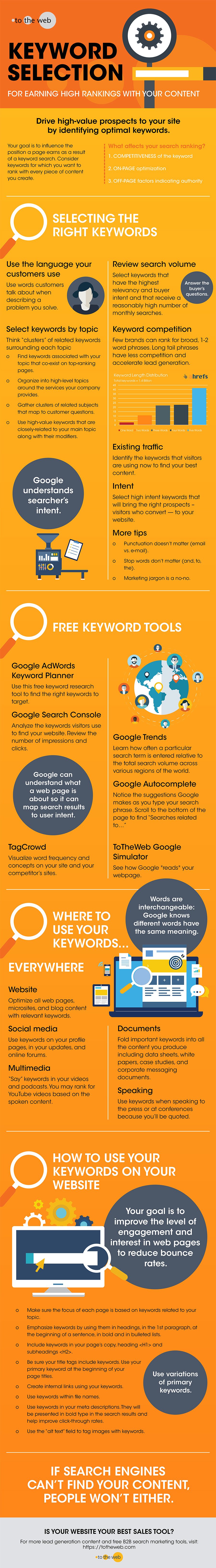
Here’s a great infographic by Pleth that hits on some of the main things that make your website look dated:
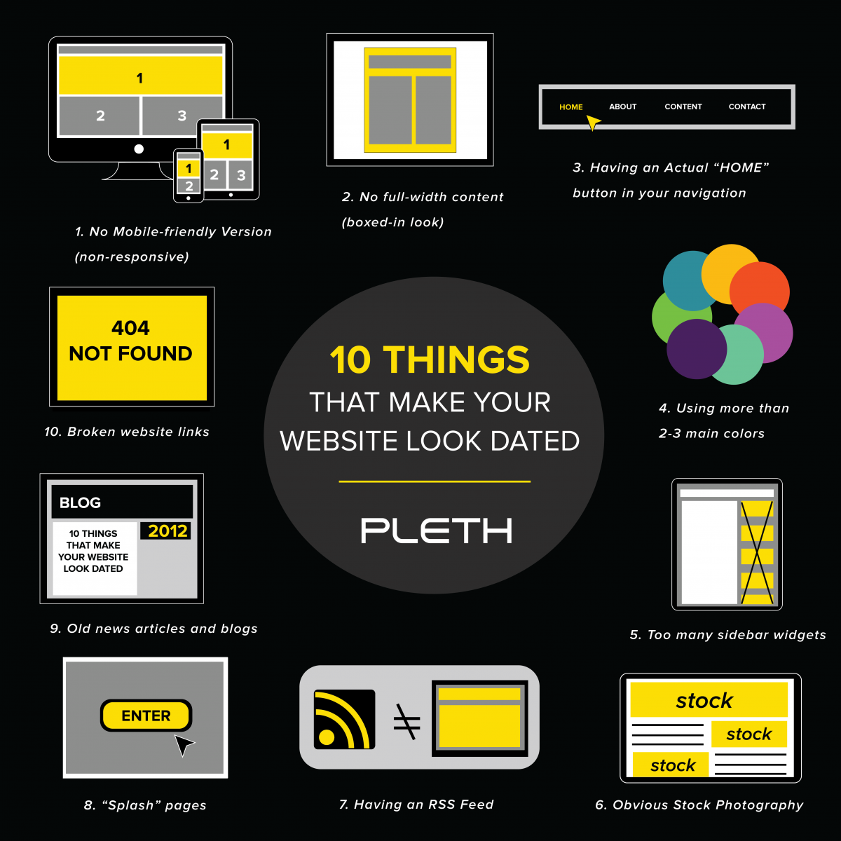
Let’s dive deeper into a few of these issues.
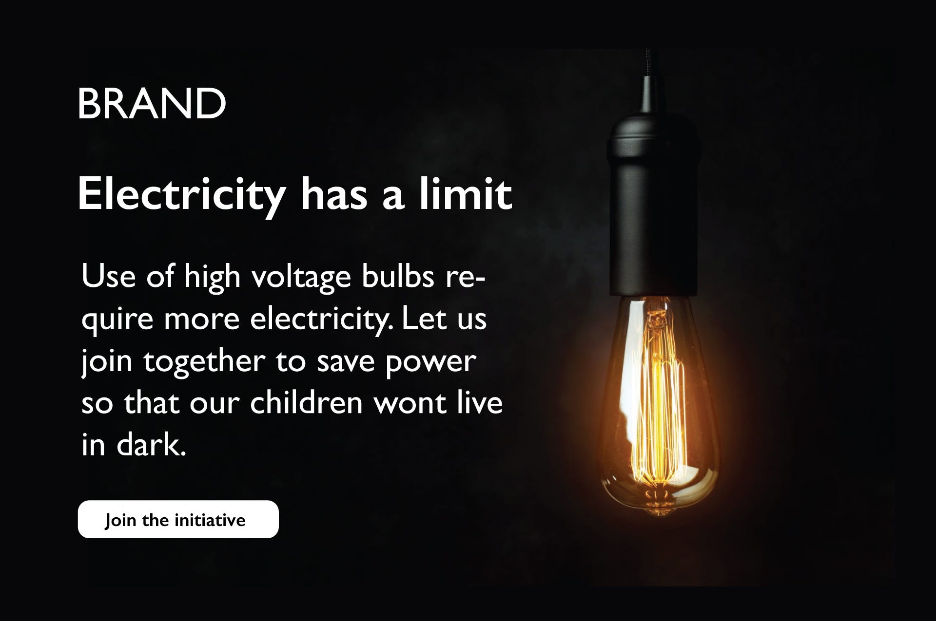
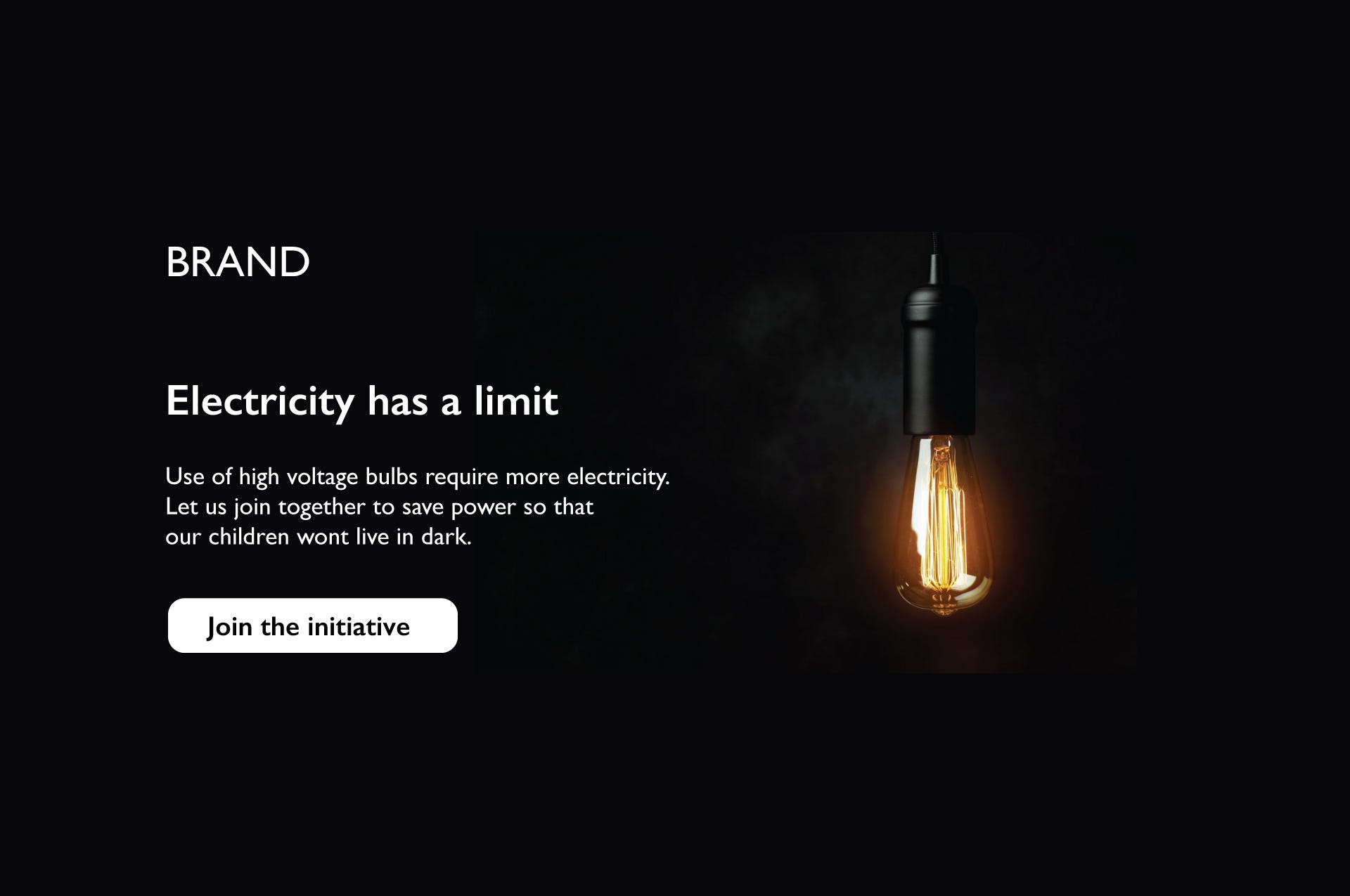
2. Your stock images are terrible
If there’s one thing that bothers me most about marketing in the mortgage industry, it is the industry-wide reliance on awful, cliched stock images.
I know that it can be hard to find good images to put on your website, but there is no excuse to use awkward stock photography that looks like you pulled it directly out of a brochure for Windows ’95:

So what makes bad stock photography?
- Too posed or unrealistic

The photo in the left looks like the induction ceremony for some type of business-based cult. All Hail Our Evil Overlord, Synergy! The photo on the right, meanwhile, looks like it could be a candid photo of an actual team at work. You want to pick stock photography where the models look natural and the scene doesn’t look too posed, regardless of what’s going on in the scene.
- Overly vague stock images

If I had a nickel for every time I saw this stock photo since I’ve worked in the mortgage industry, I would have THOUSANDS OF NICKELS. It makes me want to scream. It’s so vague; it doesn’t convey anything at all.
- Over-exaggerated emotions

I don’t care how much you love your job, no one in the history of the universe has ever looked this in real life (unless they were on something a bit stronger than caffeine).

The same applies to stock photos of new homeowners. I don’t care how excited you are about your new home, the over-exaggerated emotion immediately reads as fake and off-putting.
- Word clouds
Just don’t do it.
- The good ole’ house key shot

Photos like the one aren’t entirely terrible but they are just so insanely overused that they become ineffective.
- Tiny fake houses and/or tiny fake money

Unless you’re marketing mortgage loans for doll houses, skip the tiny house stock photos.
- The infamous handshake shot (featuring bonus tiny house)

No no no no no no no. Avoid at all costs.
____
So where can you find decent stock photos?
- Envato Elements is what we use here at Maxwell. It’s subscription-based, so a low monthly fee gives us access to a large selection of quality stock images, illustrations, icons, and graphics.
- Masterfile and Getty Images both have a huge selection of high-quality photos with different licensing options
- Offset is owned by Shutterstock but their stock photos don’t have that cliched Shutterstock feel. Features lots of high-quality stock images and illustrations, all with royalty-free licensing
- Unsplash and Pexels are both great resources for free, high-res stock photos that aren’t overused or cheesy
- Adobe Stock has phenomenal stock images and if you have a subscription to any of Adobe’s other software applications, I believe you can get an Adobe Stock subscription at a cheaper rate.
- Citizen Stock offers portraits of everyday people (not professional models) against white backgrounds so it’s easy to drop them into a different scene as needed.
- Death to Stock is an artist-owned co-op that provides authentic stock photos and videos with unlimited downloads and new work added every month
3. Your fonts suck
This one goes hand-in-hand with what makes your website look dated. Certain fonts are popular at different points in time, and whether or not it’s a subconscious thing, the font you choose can make your website seem outdated if you pick something that’s gone out of style.
Case in point: Comic Sans.
I would hope that this would be such an obvious no-no that I wouldn’t have to mention it, but I’ve seen a mortgage website or two commit this faux pas recently. So, font rule number one: NEVER, EVER USE COMIC SANS (or Papyrus or Impact, while we’re at it). Comic Sans is not just dated; it’s also reads as amateur. No millennial is going to take your website seriously if you use Comic Sans or a similar font.

You may be thinking, “it’s just a font, what’s the big deal?” To that I say, “IT’S A HUGE DEAL.”
In the same way that our facial expressions, gestures, and tone of voice help add context and meaning to our words when we speak to someone in person, the fonts you use give written words on your website more context and meaning.
Different fonts convey different emotions. A bad font selection can completely change your message, even if your words are the same:

As Sarah Hyndman, graphic designer and author of Why Fonts Matter, explains:
“Psychologists Samuel Juni and Julie Gross asked 102 New York University students to read a satirical article from The New York Times. Each was given the reading randomly printed in either Arial or Times New Roman. Afterwards they were asked to rate their response to what they had read. They rated the article as being funnier and angrier, in other words more satirical, when it was read in Times New Roman.”
Bad fonts can also make your content harder to read (sometimes with disastrous results):


Picking the right fonts is crucial to really nailing your website. And it doesn’t even have to be difficult. This list of great Google Font pairings is a great place to start if you’re considering new brand fonts but don’t feel like doing a bunch of research into typography.
4. Your website is too busy
A great website gives the visitor enough information that they want to stay on the website but not so much information that they get overwhelmed.
Take a look at Chase’s current website. In the first several seconds on the page, the visitor is drawn to look at buttons that prompt them to 1) learn more about credit card options 2) sign in to their existing account 3) open an account 4) learn about mortgage loans and 5) learn about auto loans.

Right out the gate, the visitor is overwhelmed by choice.
You may think it’s helpful to give prospects all the information they could possibly want as quickly as possible, but that can actually be counterproductive.
A 2000 psychological study found that humans are terrible decision-makers when they are given too many choices. This is called the Paradox of Choice, and this psychological phenomenon occurs when people get ‘choice paralysis’ and struggle to make decisions when they’re offered too many different possibilities.
If your website is visually cluttered, gives the visitor too many options, or has an overwhelming array of menu items, you’re probably hurting your website performance.
And the Paradox of Choice doesn’t just make it hard for people to choose; having too many choices decreases a person’s satisfaction with their final selection overall.
Ask yourself: when a potential customer visits your website, are they able to get the information they need in three clicks of the mouse (or less)? If your answer is no, it’s time to simplify your website.
Do This, Not That
I hate to fall back on cliches, but your website will perform better if you adhere to the old K.I.S.S. strategy: Keep It Simple, Stupid.
Rather than visually overwhelm prospects with a deluge of color, text, and places to click, like this:

Try to aim for a simpler, cleaner design that uses color and layout to draw the visitor’s eye right where you want it:

This is a great example from Spotify of functional, clean design. Your eye goes right to the “Get Spotify Free” button (also known as a “Call-to-Action”).
The path for visitors is simple and straightforward. No choice paralysis or overwhelming confusion. Obviously, your website will need to have a bit more info on it than this, but just remember that simplicity is your best friend in increasing conversion rates.
5. Your website doesn’t have enough white space
White space (or negative space) is a graphic design principle that literally refers to the blank space around text or graphic elements (for example, the margins on a Word document = white space).

Not having enough white space around the elements on your website a) looks bad from an aesthetic perspective and b) can make comprehending the text on your website difficult because there isn’t enough space around the words so it’s overwhelming to our eyes.
Here’s an example of why white space is important.
Consider this…
…. compared to this:
While it might seem like the most logical thing to make your text and images on your website as large as possible, as you can see above, the version with the much larger text is visually overwhelming and your brain kind of hates looking at it.
By just tweaking the image and text to be smaller, there is more white space around all of the elements and the room they have to breath means your eyes aren’t overwhelmed, for a much more compelling end result.
Apple is notorious for using exaggerated white space in their design to draw your eyes exactly where they want it to be: on their products.
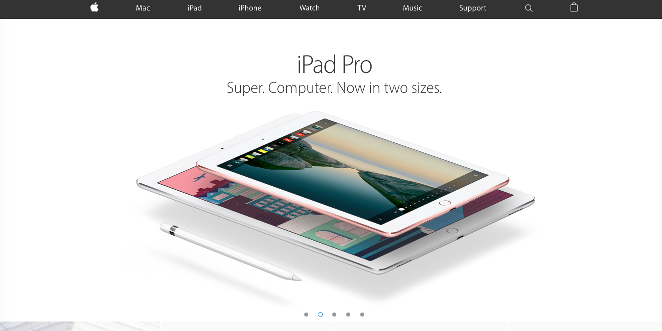
Use more white space on your website to make your site design more pleasing to your visitors and to draw their eyes to exactly where you want them to focus their attention.
6. Your website is not mobile-friendly
How your website functions on mobile can have a serious impact on how potential customers view your brand.

According to Statista, more than half of global web traffic comes from mobile devices, and website visitors who have a hard time navigating your website on their phone will probably leave your site and never come back.
Just in case you missed this on the graphic above, I want to reiterate:
If your website doesn’t work well on a smartphone, 48% of visitors will assume you don’t care about their business and 79% of visitors will go back to Google and search for another site instead.
Your website should be set up to render differently on a mobile screen so the content is still easily consumable, regardless of device:

Back in 2016, Google changed its algorithms to index standard websites and mobile websites separately. What that means is that if you have not optimized your website for mobile traffic, your overall search engine rankings are likely lower than they would be if your website was optimized for mobile.
7. Your website is not search-engine optimized
And while we’re on the topic of optimization, you’re only hurting yourself if your website is not designed with good search engine optimization (SEO) tactics in mind. As competition stiffens in mortgage lending, it is getting harder and harder to stand out to potential borrowers.
Optimizing your website to boost your search engine rankings is crucial , now more than ever.
If you’ve got a big budget and can hire an agency or consultant that specializes in SEO, then DO IT.
If you’d rather bootstrap your SEO yourself, it’s not as daunting as it seems. It’s pretty much just all about learning how to game the latest Google search algorithm.
Moz, Search Engine Land, and Neil Patel are phenomenal resources for learning more about what makes an SEO-friendly website and how to use the latest tactics in SEO to improve your search rankings.
But if you’re lazy like me, click here for a comprehensive infographic that will teach you the must-know basics to good website SEO.
______
I know this is a longer post than we usually do here at Maxwell, but it’s an important topic and one that carries even more weight now as competition in lending stiffens. If you haven’t updated your website in the last three years, it’s time for a refresh. If you’re committing any of the website sins above, it’s time for a refresh.
Fewer potential borrowers in the market means it will be all the more difficult to win their business, and if your website and digital marketing efforts lag behind that of your competitors, your margins may suffer in 2020.


